Mistakes Worth Making
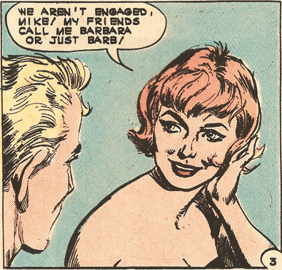
Below is the art the way it looked when it was published in FIRST KISS #30 in 1963. Charlton’s printing was rarely good and here it’s just plain crummy. To see how crummy keep scrolling down for a side-by-side comparison with the LAST KISS art.
When I bought the rights to FIRST KISS years ago, in the deal Charlton included black & white photostats (or negatives) of all the art. That’s what I’ve been scanning from and while the stats are sometimes dirty or of poor quality they’re usually far superior to the art as it appeared in the published comic books.
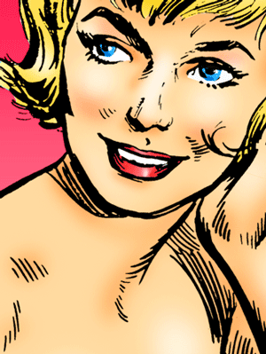
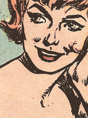
In the LAST KISS art (below left) you can still see some of artist Luis Dominguez’s fine line work. There’s plenty of detail for the eyes, the eyebrows and shoulder. But in the published FIRST KISS art (below left) that’s all disappeared or bulked up into muddy blacks. Such a shame!
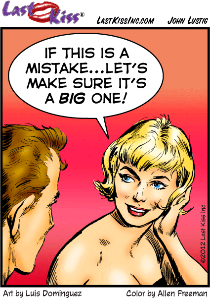
WOMAN: If this is a mistake...let’s make sure it’s a big one!
Art by Luis Dominguez

