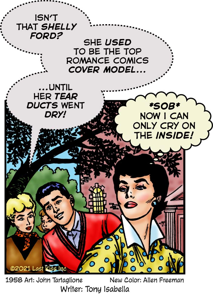
I literally laughed out loud when I read Tony Isabella‘s gag for this art. For those of us who know romance comics, it’s outright hilarious!
Sobbing, broken-hearted females graced the covers of a staggering number of romance comics. Love didn’t make these women happy. It made them miserable—before their inevitable happy endings, of course.
Crying damsels in obvious distress didn’t appear on the covers of every romance comic. But they showed up so frequently that it must’ve been a challenge for the artists. How could they top the misery level of previous covers? How many tears were enough? Or too much?
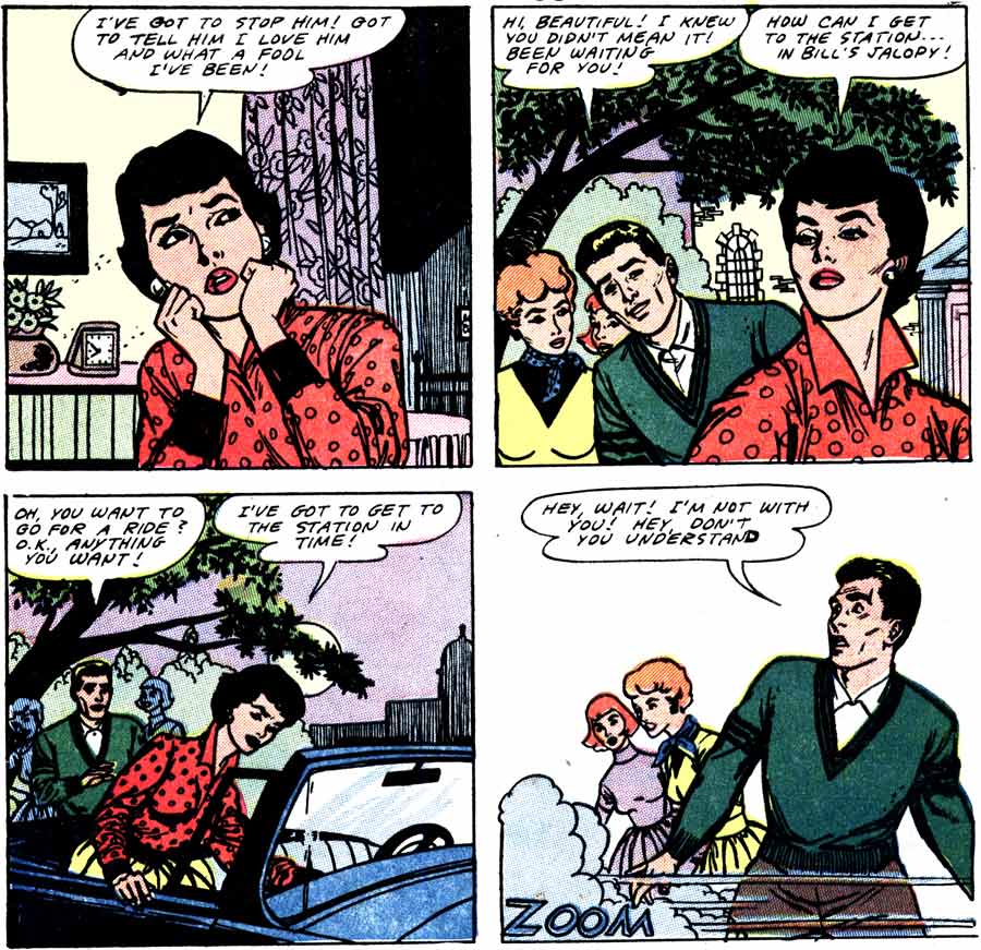
Original Vintage Art & Text

Art by John Tartaglione from the story “To Stella with Love” in FIRST KISS #3, 1958. Click link to read the vintage comic book where this art first appeared.


What was it about in the fifties, people using the passenger door to get in and out of cars and not the driver’s door?
I remember the cars in the fifties, you could fit three people in the front and slide from the passenger side to the driver side because the shift lever was on the steering column not the floor.
I think Rudolf is right about the cars from the 1950s. I’ll add that—if think—bucket seats were rare and bench-style seats were the norm. So sliding from one side to the other (or making out) was easier.
However, I think there’s something else that’s also going on here.
I think by having the woman entering from the passenger side is a visual tease to make readers think she’s going to be the passenger. So there’s a bigger surprise when she turns out to be the driver and zooms away!
I just can’t bring it to mind, maybe you other funny people can help:
Something about how karate masters are *whatever* on the inside. Laughing, crying, etc…
Ring any bells?
Anyway, she must be good at karate?
Sorry. I don’t have a clue about the karate reference, Rex. But I think it’d be wise not to cross this tearless temptress—just in case.