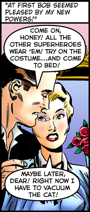
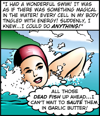
Last Kiss specializes in outrageous, sexually charged, single-panel gags. But, for the next few weeks, that’s going to change.
Starting June 27, there will still be plenty of outrageous humor (and some sexual innuendos), but Last Kiss creator John Lustig is going long and wide with a 10-part storyline featuring perhaps the unlikeliest hero in comics:
“Martha StewTart…Domestic Superhero.”
“Most of my current readers have never seen this story,” said Lustig. “But back in 2001 a black-and-white version of ‘Martha StewTart’ appeared in my Last Kiss comic book series. It was easily one of the most popular stories in the series.”
The story shows how Martha—once a homemaker who’d need a cookbook and massive luck just to boil water—gains superpowers that turn her into a crazed, culinary superhero.
“In a way, she’s really more of a super villain,” explained Lustig. “She totally loses touch with reality. What she does to her poor husband is loony, but definitely criminal.”
 In addition to being in color, each episode of the story will give readers a chance to see Lustig’s original 1960s romance source material. (Lustig bought the rights to the First Kiss romance series from Charlton Comics and rewrites them for Last Kiss.)
“On my website, along with each day’s episode of ‘Martha StewTart,’ I’ll be running the corresponding panels from the Charlton story “Forever and a Day” drawn by Charles Nicholas & Sal Trapani,” said Lustig. “I think it’s going to be a kick for readers to see how far (and how close) I came to the original romance storyline.”
Last Kiss appears Mondays, Wednesday and Fridays on http://www.gocomics.com/lastkiss
and https://www.lastkisscomics.com/.
The “Martha StewTart” storyline begins June 27. It will be briefly interrupted by a special July 4th standalone Last Kiss comic jointly created by Lustig and Mike Pascale. Following that, “Martha Stewtart” resumes July 6 and concludes July 20.


I really love seeing the original panels that you re-write, especially how your versions could almost be the subtext of the 1950’s versions (or even what the original writers were thinking), and now there’s something I’ve been meaning to ask for a while: Why are the repros of the originals stretched out so? Are you deliberately distorting them to fit in the space provided?
While not a very big deal, it is a bit annoying.
Hi, Neil. I’m glad you’re enjoying the series. I agree that the distortion is annoying. I’ve been struggling with the original art distortion problem for some time now. It only shows up (I believe) when all three of the following situations occur:
1. When you’re viewing that day’s comic from the home page—-as opposed to my comic archive.
(To see that day’s comic in the archive view, either click on the Last Kiss comic for that day or click on the comic’s title. You’ll often see a larger version of the comic as well as larger version of the original art.)
2. When the day’s Last Kiss comic and the original art have substantially different proportions.
3. When I’m trying to run the art fairly large in the archive view. (The homepage view is restricted in size and so compresses the images down. The Last Kiss comic stays proportional when it’s shrunk in the homepage view. The original art, though, is sometimes distorted.)
I’m going to try something new to fix this. I’m going to run the original art fairly small while it’s the current comic. This’ll keep the homepage version from being distorted. But the image will be clickable if people want to see a larger version.
Let me know if this works better for you. And thanks for the feedback!
Hey, thanks for the quick reply! and yes, it’s much better this way.